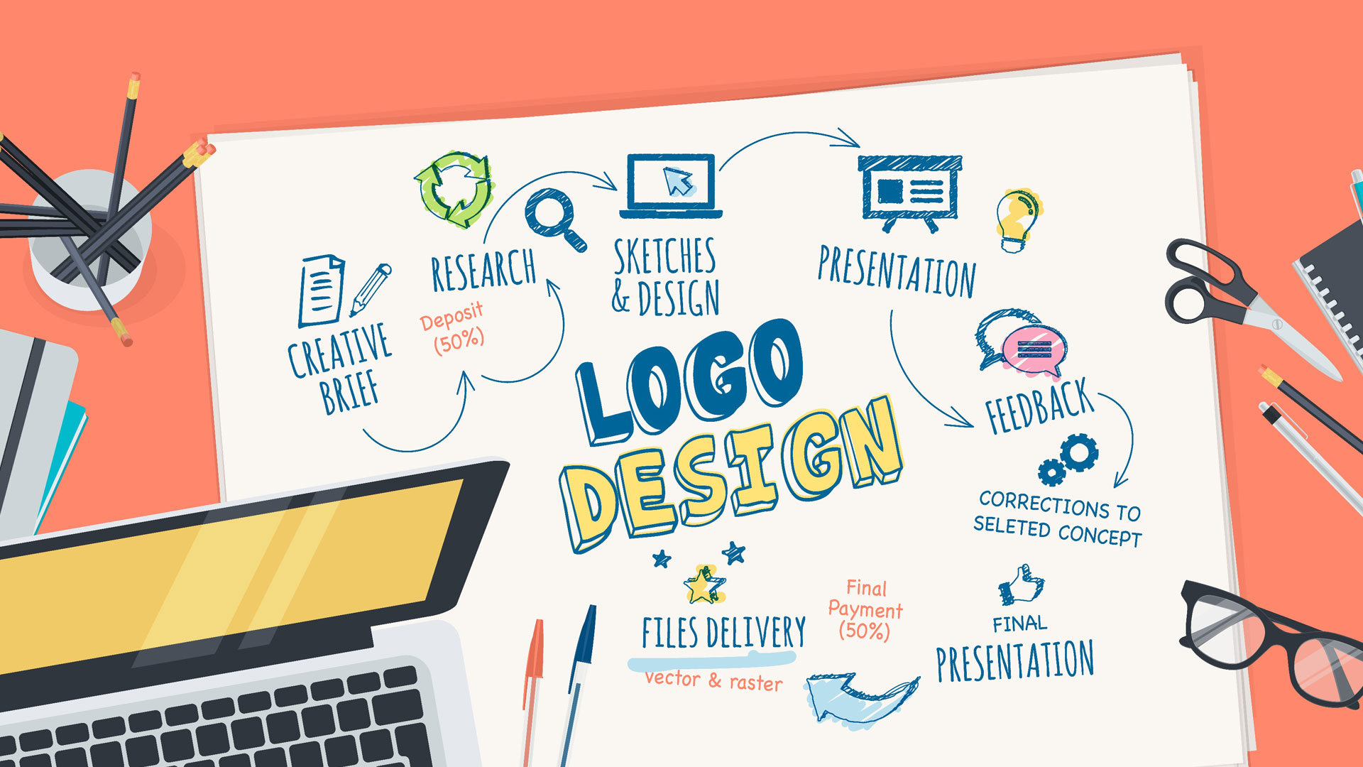
The logo is the visual identity of your brand. A good logo can help build your brand recognition, and deliver your brand values. While designing a logo for your brand, there are lots of things that you need to consider.
Avoiding some common pitfalls can keep the logo design process a positive one. With all of that said, let’s now look at the tips you should follow when designing a new logo.

1. Simplicity

There are a few golden rules you should follow when designing a logo, and perhaps the most important one is- simplicity. A logo should be easier to recognize, and one of the best ways to achieve this is to keep it simple. Simplicity makes a logo easily recognizable and memorable. Think about the McDonald’s logo, which is extremely simple- a yellow M. Simple yet compelling. You can quickly realize there is a McDonald’s restaurant by seeing its bright yellow anchor sign.
2. Timeless
Don’t follow design trends. Logos designed based on the latest trends and preferences will quickly become dated and no longer effective.
A well-designed logo should be timeless. If you want to keep your logo stand the test of time, you should avoid using the elements and effects that do not have longevity.
3. Flexibility
Once a logo is designed, it will appear in many marketing resources, such as websites, business cards, social media, and various graphic prints. It’s important that your logo is legible in all sizes, whether it is on a small business card or a giant billboard.
Your logo needs to be something that can be scaled up or down without losing quality and effectiveness. If you can take advantage of file formats like Scalable Vector Graphics.
4. Color
Every color has a different implication and can deliver a wide range of messages and emotions. For example, red can evoke a feeling of passion, love, and strength, while blue gives a feeling of professionalism, tranquil, and trustworthy.
So carefully decide your logo color scheme and try to make it match your overall tone and image of the brand. Also, make sure that your colorful logo translates well in a single color, like black & white. If not, it’s might not be a qualified logo.

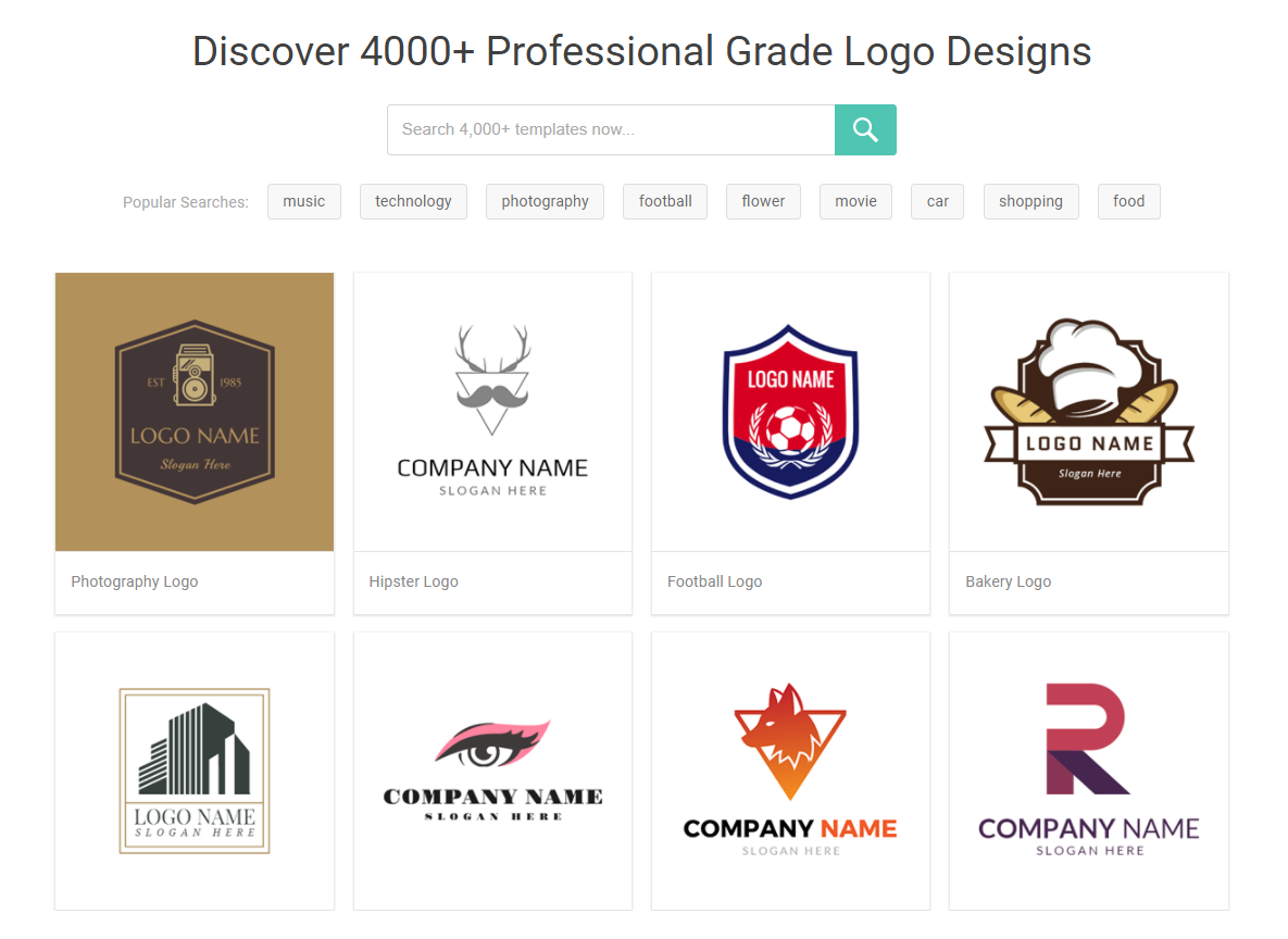
Fortunately, with a lot of logo design services, designing a qualified logo design is much easier than before. If you’re struggling to design a logo and have no idea how to get started, I highly recommend you take a moment to play around with DesignEvo, an easy-to-use online logo maker that provides a perfect solution for logo creation. It has over 4,000 professionally designed logo templates and a plethora of powerful editing features, helping you get off the ground easily. With it, you can really make some good quality logo designs with ease.
Conclusion
It’s pretty clear that coming up with a good logo would be extremely difficult without understanding some core principles.
With some knowledge of graphic design, what logo styles you like, and the colors, font, and images you prefer to convey your message – your logo design journey will surely be easier. Hope the tips above can help point you in the right direction with your new logo design. If you enjoy the post or have some suggestions, let us know in the comments.
Leave a Reply