The moment a visitor lands on your website, they’ve entered your sales funnel.
Your goal is to convert as much site traffic as possible.
So, every step of the way, you need to tell people what to do next. Without effective calls to action (CTA), nobody will buy. This is how to craft and enhance your CTAs for optimal conversion.

What makes a CTA effective?
The bottom line is that an effective CTA is compelling; it makes readers want to take action. So, which elements contribute to the power of a CTA? A successful call to action is:
EASY-TO-READ, CONCISE, CLEAR, and DIRECTS THE READER TO TAKE ONLY ONE STEP.
Sounds simple, right? Well, it is, but it’s not necessarily easy, especially if you don’t know what you’re doing. Follow these steps to craft potent CTAs at any stage of the sales funnel.
Step 1: Ensure That Your CTA is Easy-to-Read
A couple elements make your call to action easy to read:
- The reader must be able to see it
- It must stand out from the rest of the text on the page
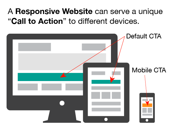
First, you must ensure that your site visitor can easily see the call to action, from any device. Whether viewing from a smartphone, a PC browser, a tablet, or anything other handhelds, your CTA needs to be visible. A simple way to ensure this is by using a responsive website theme – one that automatically adjusts layout and image sizes based on the device used for viewing.
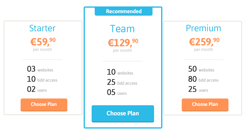
Next, the CTA must stand out from the text on the rest of the page. The image above showcases a call to action that stands out with the use of a button. Text can also be made to stand out by using a bold font or complementary color.
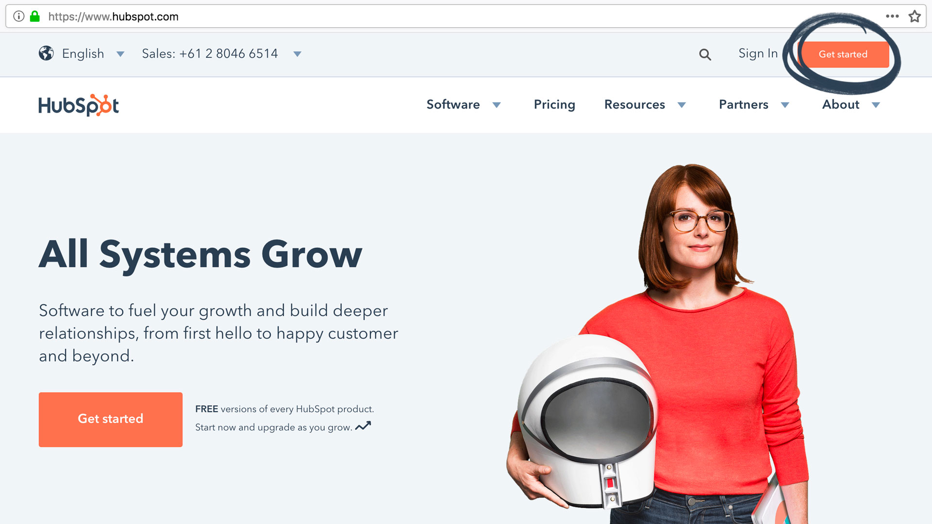
HubSpot, a leader in online marketing, uses calls to action in their navigation menu. The primary CTA, “Get Started,” stands out from the secondary, “Sign In.” A colored button makes the primary the most visible while the secondary is separated from the main navigation menu by location and font.
Step 2: Keep Your Text Clear and Concise
The last thing you want is a CTA that is messy or unclear. Upon reading, your visitor should instantly know precisely what you want them to do; this includes asking them to take only one step. If you must allow visitors more than one option, break them into more than one CTA.
Optimizely gives homepage traffic the options to learn more about their software or try it free.
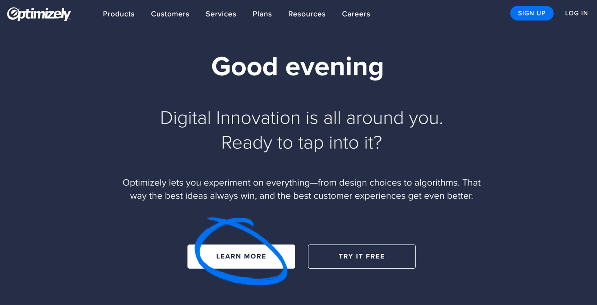
Keep in mind that the option that you prefer visitors to take should be bolder than secondary CTAs – it should stand out and be more “clickable.”
Step 3: Use Words that Create a Sense of Urgency
In some cases, simple word use is fine: “sign in.” No psychological tricks are needed. But, in some cases, power words, words that create a sense of urgency are needed: “shop now.”
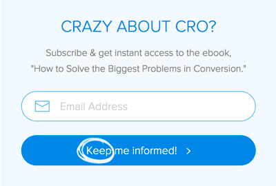
Crazy Egg uses urgency to attract newsletter subscribers.
When you want a reader to take any action that is not necessary for them to move forward (signing in or registering for an account), you’ll likely benefit from using words like the following:
- Now, Only, Today, etc.
- Fast, Hurry, etc.
- Discount, Free, Try, etc.
- Buy, Ends, Instantly, Keep, New, etc.
The urgency in CTAs leads consumers to prioritize taking action right away. Once they leave your site, they’re unlikely to come back without a little nudge. So ask them to “sign up now” before they navigate away.
Step 4: A/B Test Your Results
Following the above steps will set you on the right path. However, all audiences are different, which means you will have to test your CTAs to see how minor changes affect conversion. For example, changing just one word can increase conversions by up to 90%.
Yet, changing the same word in another campaign decreased conversions by 24.91%. You should monitor, analyze, and update your CTAs regularly to keep them optimized for your audience on all pages.
Final Thoughts
Calls to action should be bold and easy-to-see. They should be clear, concise, and asking readers to take only one action. In cases where the next step is not necessary, your CTAs should create a sense of urgency. Even when you follow all of these rules, you need to monitor your results to appeal to your audience.
Keep an eye on your conversions and do everything you can to optimize your results.
Leave a Reply